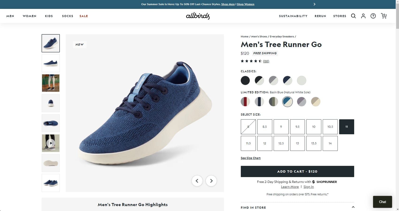
Keeping critical call-to-actions (CTAs) above the fold on Product Detail Pages (PDPs) is crucial for optimizing user experience and driving conversions. Here’s a detailed guide on how to effectively position CTAs above the fold on your PDPs and why it matters.
Importance of Above-the-Fold CTAs
- Immediate Visibility: The area above the fold is the part of the webpage that is visible without scrolling. Placing CTAs in this prime real estate ensures they are immediately seen by visitors.
- Higher Conversion Rates: CTAs that are visible as soon as the page loads can lead to higher conversion rates, as users are more likely to engage with the action prompt without needing to scroll.
- Improved User Experience: A well-placed CTA above the fold can streamline the user’s journey, making it easier for them to take the desired action quickly.
Best Practices for Placing CTAs Above the Fold
1. Strategic Placement
Positioning:
- Prominent Location: Place the primary CTA in a prominent location, such as near the product title, price, or product image.
- Visual Hierarchy: Ensure the CTA stands out through visual hierarchy. Use size, color, and contrast to make it more noticeable than other elements on the page.
Example: A “Buy Now” or “Add to Cart” button should be placed close to the product image and price to catch the user’s attention immediately.
2. Compelling Design
Contrast and Color:
- High Contrast: Use a high-contrast color for the CTA button to make it stand out against the background and other elements on the page.
- Brand Colors: While the button should stand out, it should also align with your brand’s color scheme to maintain a cohesive look.
Example: If your site has a white background, a brightly colored CTA button (e.g., red or blue) will attract attention without clashing with your overall design.
Size and Shape:
- Optimal Size: Ensure the CTA button is large enough to be easily clickable but not so large that it overwhelms other content.
- Rounded Corners: Buttons with rounded corners often perform better as they are perceived as more clickable.
Example: A medium-sized, rounded button with the text “Add to Cart” can be both user-friendly and visually appealing.
3. Clear and Actionable Text
Concise Copy:
- Action-Oriented Language: Use clear, action-oriented language that tells the user exactly what will happen when they click the button.
- Benefit-Focused: If possible, highlight a benefit in the CTA text (e.g., “Buy Now – Free Shipping!”).
Example: Instead of a generic “Click Here,” use “Add to Cart” or “Buy Now” to provide clarity and urgency.
4. Supporting Elements
Trust Signals:
- Customer Reviews: Place star ratings and customer reviews near the CTA to build trust and encourage action.
- Stock Information: Showing stock levels (e.g., “Only 3 left in stock”) can create urgency and prompt quicker decisions.
Example: A small section showing “4.5 stars based on 200 reviews” right next to the “Add to Cart” button can boost user confidence.
Price and Promotions:
- Highlight Discounts: If the product is on sale, clearly display the discounted price near the CTA.
- Free Shipping: Mention any available free shipping offers close to the CTA to provide additional incentive.
Example: Displaying “$99 (20% off) – Free Shipping” right above the “Add to Cart” button can be very persuasive.
5. Mobile Optimization
Responsive Design:
- Mobile-Friendly CTAs: Ensure that the CTA is easily tappable on mobile devices, considering thumb-friendly zones.
- Sticky CTAs: Use sticky CTAs that remain visible as the user scrolls down on mobile devices for constant visibility.
Example: A sticky “Add to Cart” button at the bottom of the screen that remains visible as the user scrolls can significantly improve mobile conversions.
Implementation Tips
- A/B Testing: Regularly conduct A/B testing to determine the most effective CTA placement, design, and text. Test different colors, sizes, and copy to see what resonates best with your audience.
- Heatmaps and Analytics: Use heatmaps and analytics tools to understand how users interact with your PDPs. This data can help you make informed decisions about CTA placement and design.
- User Feedback: Gather user feedback to understand any potential issues with your CTAs. This can provide insights into how you can improve their effectiveness.
Final Thoughts
Keeping important CTAs above the fold on Product Detail Pages is essential for maximizing visibility and driving conversions. By strategically placing CTAs, designing them for impact, and supporting them with relevant information and trust signals, you can significantly enhance user experience and encourage more users to take action. Regular testing and optimization are key to maintaining the effectiveness of your CTAs and ensuring they continue to perform well as your website evolves.


